And so this is it, the final post of this academic year, and what a crackin' year it has been. Before I get properly into this post, and reflect on my last project of year two, I just want to take the opportunity to thank all the tutors for their support this year, and anyone I worked in a group with, as I wouldn't have made it through without your help.
After a week of mulling over what me and my group achieved in the Alice project, I can safely say that I am the proudest I have been so far this year. The quality of the level is great overall, even with a few issues with loading and the like, and everyone has their own individual star pieces throughout the game which is nice to see.
One part I definitely feel has been very successful is that the style throughout the game has remained consistent. Our style guide has proved to have been easy to follow, as every member has produced assets which are in-keeping with the theme of the level and don't stand out and throw it off balance. This was something I thought we were going to struggle with, after having not produced a guide until quite late in the game, but in the end it worked out very well for us.
Another stand-out part of the level is the gameplay element, which I have to say lies on the shoulders of Jake and Emily mainly, so massive kudos to them. I feel like our game is genuinely fun to play. Some parts are a little difficult, with jumps being a bit too unforgiving, but apart from that it plays well and introduces the game mechanics smoothly. As well as this, we have a few cut scenes to split bits of the level up, and even some dialogue, which all add to the level nicely. Jake also incorporated some interesting loading screens to help make the transitions from each level more interesting, and these work well. I am definitely pleased we chose to keep the game as a side-scroller, because there's elements of gameplay that would have no existed if we had chosen otherwise, and I think these are what make our level work the most.
A bit of an issue, which we are still trying to fix now, is loading times. When transitioning to the forest area, the game takes an impossibly long time to load, almost seeming as if it has crashed every time. We had to wait a good ten minutes or so to get it to load last time, and if we're not careful people are going to think the game is unplayable. To help with this, we are working on reducing the loading time dramatically. And also, if we put some sort of animation into the loading screen, it will be obvious to the player that the game is still loading, rather than just crashed,as the animation would be frozen if it had crashed.
Overall, I am so proud of my team it's unreal (no pun intended). I was constantly in awe the whole project at the skills and talents of my teammates, and I think we can all be really happy with the game we have managed to produce this project. We will now hopefully iron out a few issues with it in time for the competition hand-in, and see where it goes from there.
Thursday, 21 May 2015
Tuesday, 2 December 2014
"Design a character"...*draws Lilo from Lilo & Stitch*
And so here it begins. The project I have been dreading ever since my painful excuse for a gladiator in my first year; a character project. I'm going to try and tackle this with optimism, because if I'm sure I'll fail miserably then no doubt that is what will happen. The brief for the project is to create to dichotomous characters that would exist in the same universe. They have to be different enough to be classed as dichotomous, but compliment each other at the same time. This initially sounded quite difficult to me but once I had a look at a few examples, it became quite apparent what sort of steps I needed to take to start this project.
My first step was to create a mood board of styles of which I would like to use as inspiration for my characters. I haven't really done too much stylised stuff up until this point, and I feel like this would be a good project to get a bit of experience of it under my belt. It also means I can be a little less detailed with the textures which is always a plus, especially when my character texturing is beyond a joke at this point. I mainly looked at Disney style characters, which I feel like may have been a little bit of a cliche, but I really admire the simple designs which show so much emotion. I decided these would be good as inspiration since there's so much reference out there for me to utilise since there's so many different Disney films, and it's also a style I'm relatively confident I can imitate.

I then felt like it'd be a good idea to jot down a few ideas that I was having, so I could have a direction to further research now that I had found the sort of style I was going for. As you can see in the rather messy chart below, I mostly took two dichotomous 'things' and then further went on to see how I could differentiate between them if I were to make them into a character. I did the most research for the sun and moon, finding out that the Greek gods Helios and Selene, gods of the Sun and Moon, were in fact brother and sister, posing for a good dichotomous relationship that still had a strong link between the two. And so, this is the idea I chose to develop further.


As you can see, I went on to develop various mood boards, first to work out what sort of facial features and hair I'd like my characters to have, and using imagery of the sun and moon to inform my choices. I decided I wanted a clearly rounded look for the moon, the female, and a more sharp edged but fiery-haired look for the sun, the male. I then began to look at clothing, mainly focusing on black, white and gold, with elements of Greek and modern mixed together.
I then went on to look at some Art Deco patterns, as I felt they had an elegance and monochromatic look that fitted well with my idea for the type of clothing and styling I'd like my characters to have. I'd also decided I wanted to incorporate some sun and moon imagery into the costume designs, just so it's more apparent that they're supposed to be Helios and Selene.
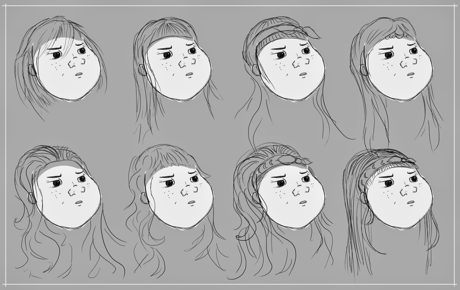
Following on from this, I had a look at putting together some basic shapes to get a silhouette for the faces of my characters. For the sun, I used a square and a circle to get some harsh edges for his face, and then with the moon I used a circle and an oblong type shape to get the curves of her face. From there, I drew over my chosen combination and put together a face for each of them. I much preferred the female face, and decided there and then that if I only got to model one of the characters it would be her. I then further explored using different hairstyles, most influenced by my prior research, until I got two basic heads with hair.
At this point, I have to say I don't like either of the hairs, but maybe that's because I'm incapable of drawing hair onto a face without using direct reference, so this may need to be something I look back at before moving forward. I also feel like at the moment they're almost too simple, and even though that's the point of Disney, at the moment the girl just looks like a copy of Lilo from Lilo and Stitch, and he doesn't even look remotely related to her.
And then experimented with body shapes, using references from life models and then exaggerating features to make it more stylised. Using these body shapes, I began to block out outfits for my characters based on my clothing and Art Deco moodboards, focusing on hers being much more rounded, and his being more jagged and sharp.


At this point, I'm not entirely sure where I'm going with these two. I don't think the designs have lived up to how good the idea was originally, and I feel like I haven't really done them justice. I have a presentation to receive feedback on my progress so far, so hopefully the tutors will be able to point me in the right direction. I feel like I've rushed this so far, as I haven't really been given a lot of time to concept before I need to present to people, and with me not being great at characters anyway this seems like a bad combination. Once I receive some feedback I'll be able to clarify exactly what it is I need to do to push these characters further, and make the most of the original idea.
Friday, 28 November 2014
'Sew' close to victory
The sentry gun project has come to a close, and if this project has taught me anything, it's that I really rather dislike working alone now. After having so much fun in the group projects prior, and then struggling so much with this one, it's pretty evident that group work motivates me way more. I wanted to take away so much from doing the sentry gun. I wanted to leave myself enough time to put it into myself and understand the mechanics of that process, so future projects would be much easier. But as always, I ran out of time, and admittedly had to get help importing it into engine, basically ruining my chances of learning how to finally get to grips with it.
I have to say, the overall look was much better than I had anticipated, since my texturing is still not really up to scratch. I wish I had left a longer amount of time to finish the texture so that I could have increased the standard, but I'm relatively pleased with how it turned out with the amount of time I had.
Another thing I wish I had allotted more time for was the poster. As a former GCSE graphics student, I should have been capable of producing a much more successful poster than I did, but unfortunately time did not permit me to do so. The poster is very basic, doesn't sell the gun well, and the actual editing of the screenshot is sloppy. It sort of fits the type of style I was going for, with it being a 1950s themed poster, but everything apart from that is just plain lazy, and I only have my timekeeping to blame.
I took a few renders in Max, which obviously don't have the glass texture on them, as that was a material I created in Unreal. But then my final render is from Unreal, which includes the glass material applied to the bottle, finishing the look.
One of the main things that bugs me about the model is that the colour of the ribbon coming off the spool of cotton isn't the same as the colour of the cotton, which looks strange. As well as this, I wish I had put more tris into the roundness of the button, as in the renders it's quite obviously very low-poly and for something that should be so round it's really noticeable. There's also horrible seam issues with the button too, which isn't ideal considering it's right at the front of the model.
I really should have ticked double-sided before I took my render as well, because the final render has a few bits missing due to this. I was just so rushed and I'm so annoyed at myself for letting myself be so rushed.
Overall, I expected this project to be a disaster due to my timing issues, luckily it wasn't quite, but it wasn't the best outcome either. If I had hurried the modelling process more, I would have actually had time to polish and fix the many issues that became apparent once I put it into engine. Hopefully in the next project, let us pray it's a group one, I can push myself a little more and sort out my huge timing issues.
Thursday, 20 November 2014
Realising I don't like thimbles...
I've modeled my gun now and I have to say I'm relatively happy with it. I've had to change a few things from my original concepts which just seemed to work much better when I tinkered with them. It was also a struggle to keep it within the tris budget due to the round shapes I used, especially the thimble...SO ANNOYING TO MODEL FOR SOME UNKNOWN REASON. But all in all I can't complain too much, it's worked out okay for the most part. I've noticed I've got so much better with keeping my geometry neater now, and I'm pleased that's become almost instinctual when I had so many problems with it last year.
Anyway, enough with the rambles, here's a few screenshots of my progress as I went along so you get an idea of how I went about it.


I feel like I'm relatively happy with the outcome so far, but I feel like I need to see it textured to some extent to get the full effect of the haberdashery style I'm going for. Plain grey doesn't really do the vintage look much justice.
It was really difficult to model all the different components I wanted whilst keeping within the tris limit due to there being so many rounded parts. Hence why some of the parts I had planned to include aren't actually there. I weighed up the most important pieces against the least important and cut out what I felt wasn't necessary. I also flipped certain parts to allow them to slot together better and make sure there weren't any huge gaps in the overall gun, otherwise it may have look a little odd and unstable. Once I had finished modelling and then priortising components, the total amount of tris came to 4,836 which I was surprised with since I had struggled previously to keep it under the 5,000 limit.
Next step is to get unwrapping as quick as possible, and then on to texturing because I want to make that look as good as possible since it's usually the part I rush. I'm only giving myself one day to unwrap since I think that's reasonable and not pushing myself too much.
Anyway, enough with the rambles, here's a few screenshots of my progress as I went along so you get an idea of how I went about it.
I feel like I'm relatively happy with the outcome so far, but I feel like I need to see it textured to some extent to get the full effect of the haberdashery style I'm going for. Plain grey doesn't really do the vintage look much justice.
It was really difficult to model all the different components I wanted whilst keeping within the tris limit due to there being so many rounded parts. Hence why some of the parts I had planned to include aren't actually there. I weighed up the most important pieces against the least important and cut out what I felt wasn't necessary. I also flipped certain parts to allow them to slot together better and make sure there weren't any huge gaps in the overall gun, otherwise it may have look a little odd and unstable. Once I had finished modelling and then priortising components, the total amount of tris came to 4,836 which I was surprised with since I had struggled previously to keep it under the 5,000 limit.
Next step is to get unwrapping as quick as possible, and then on to texturing because I want to make that look as good as possible since it's usually the part I rush. I'm only giving myself one day to unwrap since I think that's reasonable and not pushing myself too much.
Wednesday, 12 November 2014
Cotton, buttons and cute things galore
I've been working on my sentry gun for a little while now and I'm kind of happy with the direction it's going. I've made some mood boards and worked up some concepts using silhouettes from the images I've collected, which is a workflow that I have yet to get completely used to. I was pretty quick to decide that I wanted to do a sort of 'higgledy-piggledy' type sentry, and that made me choose to do something based on items you'd find in a haberdashery. I'd also hope to incorporate some mechanics from a sewing machine in there and have every piece something completely related to sewing.


If I'd have had a longer period of time to complete the project, I would have perhaps tried to churn out some more silhouettes to come up with a more interesting bunch than I ended up with. Sadly, as the time is very limited with this project, I chose to move on quickly and just make the best of what I had, and so my top three were taken forward for more development.


I realised pretty early on that nearly all of the sewing materials I was collecting as reference were what you'd call 'vintage' or 'old-fashioned' and so it only seemed natural to base my gun on a specific time period. I chose World War 2 due to the big 'Sew For Victory' campaign that was happening at the time, and I felt a gun made of sewing equipment would fit quite well.
I then went on to take some silhouettes from my mood boards and turn them into a sort of kit of building blocks for some guns. I randomly placed the objects down until I got a shape that looked remotely like a sentry gun, until I had a fair selection to choose from.
I felt by doing this I really struggled to get many that actually looked like they could be working sentry guns, and also, I just found it difficult in general to come up with so many different ways to compose the shapes. This then led me to take some pictures of a sewing machine and make some more detailed silhouettes from those, which I then laid on top of my existing silhouettes to attempt to make them more interesting.
If I'd have had a longer period of time to complete the project, I would have perhaps tried to churn out some more silhouettes to come up with a more interesting bunch than I ended up with. Sadly, as the time is very limited with this project, I chose to move on quickly and just make the best of what I had, and so my top three were taken forward for more development.
To me, the bottom two look a little bit too modern for the look I'm going for, especially the bottom one as it looks like a needle full of chemicals from a sci-fi movie. I felt like the top one looked quite retro in a way, almost resembling a cutesie ray gun, and I quite liked the feel of it. My favourite design of the top three is the end one, simply because it is the most interesting of the three silhouettes.
It's been important for me from the start to make sure the gun is made solely from objects you'd find in a haberdashery, and so my next aim was to split the gun up into shapes that could all be recognised as equipment used for sewing. I found this more difficult than I had anticipated, and perhaps now I feel like there was a much easier way of approaching this rather than making silhouettes out of the shapes to then piece the shapes back into it. After two attempts, I felt like my second try was as successful as I was going to get, and I am eager to start the modelling process so I'm going to go with it.
Hopefully in my next post I'll be able to show you some progress regarding the modelling and texturing, I don't expect the modelling to take me too long, as I seem to knock things up pretty quick these days, it's the texturing I'm more worried about time-wise, as it's going to be full of lots of different textures and components, which comes with the very nature of the gun, and I just hope I haven't bitten off more than I can chew. I can only try my best I s'pose, and I'm happy to feel like I'm pushing my technical skills a little.
Saturday, 8 November 2014
Film room project post mortem - white scribbles explained
It's been a week now and I've had time to really think about the film room project and assess how well we actually did. Strangely enough, reflection time hasn't really changed my opinion on how well we did, I'm still pretty pleased with how things went. And I've racked my brains numerous times to try and think of how we might have better used our time in certain aspects and all in all I don't really think it'd have made much difference no matter how we'd have allocated our time. We did about as good as we could managed at this stage, and I can be proud knowing that fact. We decided to circle aspects of the screenshot to highlight areas that weren't perfect, and so for my post mortem I'll go through a few of them just to clarify what we mean by all the white scribbles.

Firstly, one of the big issues is the actual perspective of the image. We always knew it was going to be an issue trying to get it spot on due to the original shot using a special wide lens which shows a pan of the room, which proved extremely hard to replicate in engine. Due to this, there are issues with actual view of room, with certain assets appearing more/less than they should in the shot. A really obvious one being the perspective of the blinds, and the large greyish mass which appears in the left when it quite clearly should not. The only way to fix this would have been to tamper with the perspective of the camera a little more, and perhaps make that portion of the wall red so it's less blatant that it shouldn't be there.
Moving on from this a little to the left, there's a large strip of light cast onto the red wall which shouldn't be there. Perhaps putting some well-placed geometry outside the window might have got rid of this, but we had so much trouble with the blinds that I'm not sure if we'd have ever got it perfect anyway.
Another thing we should have maybe looked at was creating the shadow found on the lower portion of the blinds. The actual colouring of the blinds is wrong to start with, but creating that odd shaped shadow on the bottom would have increased the likeness even moreso. Again, this was just an issue with the lighting, and whether we'd have been able to ever get this perfect I cannot say, especially as I have basically no knowledge of lighting myself, it'd have been up to my other team members sadly.
As I discussed in my earlier posts, certain assets, especially those which I made, aren't properly scaled in the scene. The one that really stands out for me is the blue vase in the foreground near the right corner. It's not coloured correctly which makes the error even more obvious, but if it had been made a little smaller in engine it would have looked a lot more similar to the original image. I totally realise this is my fault, and had I been more focused on particulars, especially those related to my own assets, I could have pointed this out to someone and fixed it, or even fixed it myself.
Another obvious perspective issue can be seen when looking at the beams. They are way too visible and at slightly the wrong angle, and due to the very nature of a beam following the flow of the room, they really help to highlight the error with the perspective. They are also too bright, which is due to the lighting being too powerful in that general area.
It's terrible but now I'm looking at the two images side by side I'm finding it so easy to nitpick and find tons of faults in our project. If I were to try again, I'd have definitely made lighting an even bigger priority than we already had. We allocated as much time as we could spare on it, but maybe we could have worked a little faster on making the assets and left an extra day or so for the lighting. Even as little as an extra couple of hours could have completely changed the outcome of the lighting. The perspective is also something else we could have worked on a little more. I think we got so fed up with it NEVER matching up that we gave up a little bit, but I reckon we could have got it even closer if we'd have given it a couple more tries. And on a personal note, I'd have made sure to be more involved with the actual putting together of the scene, as I could have helped point out errors and made sure my assets were in the correct places and the correct size.
All in all, I still stand by what I said originally and think that we wouldn't have been able to achieve much more in the time we were allocated. Our team worked relatively well together as a unit, but it was quite obvious certain members did do more work than others. Perhaps in a different team with individuals all working to a similar level we might have achieved something of better quality, but I don't want to dwell on that, it's important to make do with the team you have at the end of the day. We managed to finish to an acceptable standard and that's all that matters.
I've learnt a lot about myself in this project. I know now that I really like to make all the little objects in a scene that no one cares about, but perhaps that isn't exactly a good thing. I think I'm a little afraid to be given something that if not done well will be detrimental to the project, and that's not a good way to feel. I feel like I need to throw myself into doing important assets in future projects, as it'll help me gain confidence and also then I can be even prouder of my achievements as they'll be more noticeable.
I'm looking forward to the next project, although I don't know how I feel about working on my own again. I really enjoy the support of a group and having people to bounce off, so being on my own again might be a not so enjoyable experience for me, but we shall have to see.
Wednesday, 5 November 2014
"All by myself, don't wanna' be all by myself..."
This is going to be a quick post mortem post on the film project, since it's been about a week now since we handed it in and I've had some time to reflect on it. There also might be the occasional sad comment about how I've now been set a solo project, and it feels a bit weird not working in a group for the first time this year.


I think the best thing to do would probably be show the original screenshot up against the finished product and then go from there really, so here it is.
So when I look back at this now so much jumps out at me as being really rather inaccurate. Once finished, I couldn't wait to push it aside and begin something else after spending 3 weeks straight on it, but now I look at it and wish I could spend so much longer on it to fix things. At the time, I have to say I was very proud of what we achieved. It may not be the most uncanny resemblance you've ever seen, certainly not as close as some of the other groups managed, but we did it in the time given and the models and textures were all pretty solid, even if the lighting wasn't so much.
One of the best parts about our project was how well we handled time-keeping for the most part. I worked out a system and certain deadlines for aspects of the project, and everyone pretty much stuck to them. It made us so much more organised, we hit the deadline with time to spare, and meant that we all were at the same stage throughout the project with each of our individual sets of models so no one got left behind.
Our teamwork ethic was pretty good as well. There were no major fallouts or arguments between group members at any time, and we all felt comfortable enough to critique each other's work when needed even though some of us had barely known each other before the project. I think the fact we weren't all necessarily 'chummy' with each other before we began the project helped us keep a sense of professionalism when discussing the project, but also meant I got to make some new friends (YAY FRIENDS).
And finally, another good part of the project for us was the models. It's hard to see in the final render, but we produced some models which were pretty spot on in terms of colour and patterns etc. The lighting has made the colours appear all wrong in UE4, but before we placed them all together in a lit scene the textured models looked good in my opinion.
Right, and as for the things that didn't go so well, firstly there's the communication side of things...We weren't terrible, but we weren't great either. At the beginning of the project, barely any of us were in labs together, and the amount of talking we did in person was limited. We used Facebook for a lot of our chatting and feed backing to each other, but I found the most important information and critique we got was when we were talking face to face or working alongside each other in the labs. We had a couple of issues where people hadn't registered certain information that was given on Facebook and ended up doing things in a way which we hadn't intended or wanted, and I feel like this would have been avoided if this kind of information could have been given in person instead.
Another big thing, which I now realise makes or breaks a scene, is the lighting. I can't even believe how much of a pain it ended up being. I'm not particularly good at UE4, and I still have a lot to learn about it, but I had even assumed I'd be capable of managing some sort of accurate lighting within the scene. Turns out I didn't have a clue, and even the team members who were better at engine stuff struggled. We waded through iteration after iteration of the lighting, some making the scene turn a pinkish colour, others making the floor appear brown, and sometimes even without changing any lighting elements at all Unreal would decide to completely change the colour palette of the scene. It was just a case of getting it as close as we possibly could, because we realised quite quickly that we were never going to get it spot on. There's shadows cast in the wrong places, light sources look too strong and not strong enough in certain spots, and my main issue with it is the change in colour of practically all the textures. All the models we'd made look so accurate have now been changed completely for reasons unknown to us. The floor was probably the biggest let down, as not once did it appear the colour it was supposed to, and what was supposed to tie the scene altogether now screams "I'm wrong" every time I look at it. But we tried our absolute best, and if we could have fixed it I'm sure we would have done during the amount of time we spent fiddling with it, so I remain satisfied with our efforts.
I learnt a ton from this project. I picked up some experience of organising a small team, and attempting to communicate and synchronise workflow. The asset swap required you to work at a certain pace because we needed to pass assets on to the next person and so on, but this project didn't have prompts like that. It was up to us to assure we go everything done on time, which needed planning and making sure we all worked at a similar pace, something I haven't really had experience with before.
Another thing was just becoming technically stronger with certain aspects of the modelling process. I explored more to do with PBR, became much better at organising folders in Photoshop (I was dreadfully unorganised before) and got a little experience with Unreal 4, which I now need to explore much further to get a better understanding. All these little developments in my knowledge make me feel good knowing that I've already learnt quite a lot after only a handful of weeks back on the course. I've learnt so much, and feel like I've improved so much already that I can't quite believe we've been here for as little time as we actually have.
And so we come to the final part, my thoughts on what we'd do better next time if we could. Well, for obvious reasons, I'd make sure I made specific time slots that we all had to be in labs together. I can't even explain how much it helped at times to have one of my team members pretty much with me the whole time I worked in labs, I only wish the other two members had done the same and I think we'd have been so much stronger. I feel like it would also have been a good idea to get everyone's numbers as well, because when Facebook failed, and no one was in labs, a quick text might have got things done a little quicker.
AND LIGHTING. I mean, I'm saying that we could have done better lighting wise, but all I could have done really was dedicated more time to it. We spent a good 4 days or so doing the lighting, and I now realise that probably wasn't enough, but I'm not sure how we would have given it more time. We could have thrown in an extra day by cutting down modelling time or something, but I'm not entirely convinced an extra day would make all that much difference. We'd have needed a week more for all I know to sort the lighting out to a degree we were happy with, and if we redid the project I know we wouldn't be able to squeeze an extra week of it in. I think I need to do another project with a heavy focus on lighting to get a better jist of how long it takes to sort it out , and then I can base my future schedules and spreadsheet breakdowns on that instead.
But alas, I must let this go now and move on to the sentry project alone. *sniffles* farewell group work.
I've realised I said this was going to be short and it's far from it so I shall leave you now with a subtle hint of what is to come regarding my sentry concepts... I LURVVVVV OLD SEWING MACHINES (especially cute toy ones like this)
(https://www.etsy.com/listing/91012351/1940s-kay-an-ee-sew-master-toy-sewing)
Subscribe to:
Posts (Atom)